Website Optimalisatie
Fine Dining Websites: How Trust Forms Before the Reservation
 Stef Wubbe
A guest does not book a table at a fine dining restaurant because of hunger or location. The evening feels more valuable, and the risk of disappointment feels bigger. That makes the choice more deliberate, and the website the first moment of judgment.
That trust does not begin in the booking flow. It starts the moment the first page shows whether this restaurant communicates with care, clarity, and consistency. If one part feels sloppy or generic, that impression carries straight through to the evening still to come.
What do guests try to understand first?
A first-time visitor rarely wonders only whether a restaurant looks good. At a fine dining level, someone wants to know faster what kind of experience is being promised, how much attention goes into the details, and whether the step toward booking feels logical.
What exactly is this concept?
At fine dining level, guests are not just choosing a table. They are choosing a style, a pace, and a way of thinking. It should quickly become clear whether the concept feels classic, minimalist, seasonal, or more ceremonial. If that distinction stays invisible online, the visitor is left with only a generic impression of an expensive restaurant.
What can I expect from the menu?
Menu visibility remains a core signal. Not because a guest wants to know every dish in advance, but because the menu shows how the concept thinks. A tasting format, a lunch menu, or a product focus says a lot about the level of the evening. Hiding it in a PDF, or showing nothing at all, leaves too much open.
Can I feel the chef and their vision?
At fine dining level, the story behind the kitchen is not an extra layer. It is often exactly what makes the reservation credible. Knowing who the chef is and where the signature comes from helps a guest understand why this restaurant is different from a well-run general hospitality venue. That story only works when it supports the rest of the site: visible in the imagery, the menu structure, and the language. That coherence is one of the strongest trust signals in fine dining.
Which website elements build trust faster?
The strongest fine dining websites combine atmosphere with clarity. They show enough to make the evening feel real, while keeping enough anticipation intact. In practice, this usually comes down to a combination of five or six signals.
A booking flow that matches the concept
The transition from atmosphere to reservation has to feel logical. If a visitor lands abruptly in a generic booking screen after a carefully built concept, the trust built up so far drops away. The booking flow does not need to be spectacular, but it should feel calm and clearly part of the same experience.
Practical clarity without losing anticipation
Opening hours, arrival windows, private dining, group routes, waiting lists, or cancellation terms do not need to dominate, but they do need to be easy to find. That small clarity tells a guest that just as much care goes on behind the scenes as in the dining room. If a restaurant also offers private dining or a chef's table, it works best as its own recognizable route rather than a single sentence buried in general text.
Imagery that supports space and rhythm
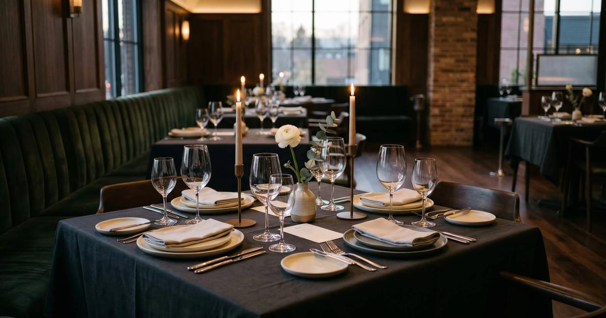
If all the photography is close-ups of plates, the restaurant feels smaller than it is. At fine dining level, the room, the table setup, and the atmosphere need to be part of the first impression too.
Care around dietary needs and restrictions
Most visitors are not looking for a long legal explanation. They are looking for reassurance: is this restaurant careful with allergies and special occasions? Too little explanation feels careless, too much feels defensive. A short, precise line at the right moment is usually enough.
Proof that the standard is real
Guide listings, press mentions, awards, or carefully presented reviews help build trust faster. Not as bragging, but as confirmation that the website is not promising more than the restaurant delivers.
Where do fine dining websites break down?
Doubt rarely comes from one big problem. More often it comes from small mismatches: the photography suggests refinement, but the booking flow feels generic. The concept sounds distinctive, but practical information is hidden. Or the chef's story reads like a standard biography while the rest of the site stays generic.
That inconsistency rarely costs every reservation outright. What it mostly does is make the concept land less sharply with exactly the guest who selects on detail, and that is usually the guest a fine dining restaurant most wants to attract. In restaurants where booking is already a deliberate choice, that inconsistency weighs even heavier: the visitor is not just comparing sites, they are comparing the standard they expect at the table.
Why is booking part of the experience, not the endpoint?
A good fine dining website treats booking not as a technical endpoint, but as the first real point of contact. From the homepage through to the booking step, it should stay clear what kind of restaurant this is, how much care goes into the work, and why this evening is worth trusting.
For fine dining, reservation trust does not start in the booking widget. It starts the moment a guest opens the site and tries to feel whether this level is real. When menu, space, chef vision, and practical clarity form a convincing whole, booking stops being a leap and becomes the logical next step.
Frequently asked questions
Should a fine dining website show the full menu?▼
How much explanation about dietary needs is enough?▼
Why does a good booking flow feel part of the atmosphere?▼
Does social proof like guide listings really help in fine dining?▼
Read more about restaurant branding and how a private chef website builds trust in a comparable way for smaller, more personal concepts.
Onderwerpen: #fine dining,#restaurant website,#website optimization,#guest trust,#reservations